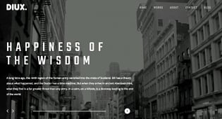
Most everyone has heard of KISS. The age old “Keep It Simple, Stupid” advice. Why is simple web design so popular? Simple doesn’t necessarily mean easy to create and in most cases simple web design is very hard to achieve and still get great results.
In most cases, simple design features and layouts can quickly draw the attention of a visitor to a website’s most valuable content, improving the user experience and delivering a return on your investment in the short attention span you have. The concept is rooted in minimalism, with origins in the arts from the 1950’s. In professional web design, it gained popularity in the early 2000’s, with the core philosophy of reducing complexity and confusion (Nielsen Norman Group). Many of you may remember how cluttered some of those early websites in the 90s and early 2000s were. Today, minimalist web design is much more than displaying a certain percentage of blank space on a web page and a call to action button. Let’s dig into some examples.
The Why of Simple Web Design
In the UX Industry Reports from UserTesting.com, it’s reported that year over year, companies are allocating more of their design budget to User Experience (UX) research to capture user feedback, test new initiatives, and benchmark their UX results over time. As customer experience becomes the driving force behind many brand initiatives or refreshes and, one of the reasons, search engines send organic traffic to websites, delivering an uncluttered website is paramount to a positive user experience.
Other studies show that helpful, unique and authoritative content is a top factor for successful websites, and the best way for good content to stand out is to present it with accentuating features, a key feature of any minimalist design.
Before you proceed with a new website or redesign project, keep these design factors in mind:
Optimize for User Experience
Home Page
No matter how simple the design, your home page should be designed to give the users the information they are looking for right away and then direct them down a funnel you have planned in order to make them do something on your site. Think of this like a funnel and where do you want to direct your users attention to. In one study, 86% of website visitors want to see information about products and services on the home page. While a minimalist home page might look cool, failing to deliver the right content or correctly highlighting your call to action options will raise your bounce rate. Try to think about the one message that resonates with your websites persona and then the path that you want to lead your visitors down. If getting users to signup to your email list is the most important thing you have to make it clear and obvious what the benefits of signing up are, what you will do with their contact information and then simply guide them through the sign up process so you minimize any drop-off.
Page Layout
Utilize the 80/20 rule when selecting a page layout. Also known as the Pareto Principle, only 20% of space is necessary to drive action toward the other 80% of the website. When planning page content, layout, and titles, write down everything in a list, graph, or chart. Identify 20% of the content as the “function” content, and make sure those items have a prominent place within your minimalist design. In addition think of the content that will be above the “fold.” The “fold” is the bottom of your webpage that can be seen on the device. So this could be the bottom of your phone or desktop computer where you can not see what is below. And finally most users scan a page in the shape of an “F,” meaning that they scan across the top row, then scroll their eyes down halfway and scan halfway across the page and then move back and scroll their eyes down to the top of the “fold.” Thinking about what the user can see above the fold and that they will scan your page in the shape of an F will help you decide how to layout important information.
Accessibility
Are the most popular questions or topics difficult to organize within a few main bullet points on your main pages? Consider creating more pages or adding an FAQ page to give website visitors with questions a definitive place to go. Make the FAQ page rich with internal links to keep visitors engaged. The more pages and content you have that are specific to one category and a few keywords the better this is for search engine optimization.
Navigation & Content Organization
Website structure is easy to do if you have a relatively small website or only a few service/product pages. When website pages equal hundreds of URLs, organizing the content can get a little tricky, especially when you’re going for a simple website design. To start try to think about how you would ideally catalogue the content on your site if it was a filing cabinet.
A professional designer can make recommendations, but you can begin by separating pages into buyer journey categories: Awareness, Consideration, and Decision. From there, use the age-old tree method or top-down approach and list them in order of importance. If you have pages that exist for SEO purposes but they are “lead-in” pages to higher value conversion pages, they don’t need to appear in the main navigation. Try to think about what the overarching pages are that define the structure of your website and then what the subpages are that are relevant to those main pages. A good trick is to write down or map out a “sitemap” of your site to see how it is organized. We like to use a whiteboard and post-it notes (each post-it note is a new different pages) and then draw lines to connect the post-it notes. This is a good way to see if you have any dead ends and how many pages you might need to design. A pro-tip is to take a photo of this when you are done and share with your web developer or web designer.
Navigation and content organization is the perfect area to begin A/B testing.
A/B testing will identify the content that drives the most action from website visitors.
Headings, Titles, and Paragraphs
While a clean website design may not contain as many words as a regular design, the words are still important. Search engines use words and phrases to crawl and index your pages, and numerous studies show that verbose blog posts (1,000 words or more) result in better rankings.
You can implement a simple web design with high word count pages; simply minimize the “busy” effect of the words with a few layout guidelines:
- Keep the headline or title to a 5-word maximum
- Use short, easy-to-read paragraphs, broken up by subheadings and double spaces.
- Use h1 tags for your most important keywords
Graphics and Images
Simple websites utilize high-quality, graphic-rich imagery that express a meaning. This is not the time to do a search for “free website images;” it’s time to invest in quality images that will draw website visitors into clicking and engaging with your brand or even create your own content with a professional photographer or videographer. If you have the budget and can create your own, you know it will be unique to your brand.
Themes and Styles
While it’s possible to design a website with a minimalist design in any CMS platform, WordPress offers themes and styles that are built on the pillars of minimalism. If you’re using WordPress, you can check out these “off the shelf, Minimalist” options:
Less
Less is a free, simplistic theme, best for small sites.
Origin
Origin is an image-rich theme ready for to customize.
Divi
Divi is very uncluttered and modern with custom options to ensure important content isn’t pushed aside.
Pierce
Pierce is a robust theme built on the Genesis framework with a responsive design that’s perfect for minimalism on mobile. Note: All these can be customized by a designer or front end engineer so if you want it tweaked and changed you can get an engineer to help you with that as well.
Ready for Simplicity? Not so Fast!
If you’re ready to jump on the simple website design train, proceed with caution. Heed these warnings as you proceed:
Don’t Sacrifice Functionality
When it comes to navigation, look into a variety of options. Tabs, collapsible menus, and scrolling click-through images can deliver a crisp, clean design without losing functionality. Google and Apple both have standards for how you can design producst to make them easy to understand while still having a lot of functionality. Here is Google’s material design guidelines.
The Need for Speed
Image-heavy websites can slow down the load times for website pages, alienating new visitors and search engines alike. WordPress offers a variety of plug-ins to optimize and compress images, and Google offers a free site speed performance report with suggestions for improving site speed. You can give those suggestions to any front end engineer and they will be able to help you optimize your images.
Beware of Neutral Typography
Project leads and designers alike lump minimalism in with neutral, and a minimalist design with a neutral color scheme that doesn’t have any “pop” that will not deliver the level of engagement you are after. Look at your brand colors, identify a few studies that identify high-conversion colors. Then work with your designer to ensure that fonts and important messages don’t blend into the background. The designer you work with should know from the start what the main messaging of your website should be.
Moving Toward Simplicity: Use Data as a Guide
If you’re embarking on a website redesign or refresh, begin collecting data as soon as possible to guide your content organization efforts. Collecting data isn’t difficult, and your web team can usually set it up in a day or less:
- Google Analytics. Make sure that landing page performance is tracking correctly. Identifying top-performing landing pages is critical to website redesign and organizational success.
- Google Search Console. Connect your Google Analytics account with Google Search Console. You’ll gain access to landing page impressions, clicks, position, click-through rates, page crawl rates, and keywords. Using this data, you can build out a hierarchy of pages in terms of engagement and value.
- Conversion Tracking. Set-up goal tracking, funnels and conversion path tracking in Google Analytics. The reports will give you data on where your users are getting stuck, where you can optimize your sales/signup funnel and what your conversion rates are.
Simplicity in web design can significantly boost website engagement rates with careful planning and a data-driven strategy.
Looking for a web design agency in San Francisco? Contact Spiral Scout, we will eagerly help you craft a minimalist website or application from scratch or refresh an existing one with a new look. Our team will work close with you to help you create a unique brand style, and based on it we’ll build a solution that doesn’t not look beautiful but is only highly functional.


