There is no specific plan that if followed will guarantee ecommerce success. Building a successful online store with Shopify can sometimes feel like a puzzle that you are building in a black box as you fumble with trying to make pieces fit together. But are there general tactics that one can follow to craft as close to a perfect store as possible? Mastering a combination of eye-catching designs, building trust, balancing the functionality your users need to convert into a buyer, and knowing the correct customer-centric features to add will all be essential to successfully showcasing your products, engaging customers, and driving conversions.
In this article, we will discuss one challenging aspect of developing your online store: optimizing your product pages to increase your conversions. Your product pages are the gateway to building trust and convincing customers to add your products to shopping carts. Optimizing the product pages of your Shopify storefront is no easy task, and it can be extremely hard to determine what to test, how to test it effectively, and what to do once you perform a test.
But don’t stress too much! We understand the importance of high-converting product pages, and we’ve gathered valuable insights on how you can optimize your product pages in Shopify to increase sales. If you end up needing help with auditing and getting ideas for ways you can audit or change your product pages, our team of Shopify specialists is here to help and is always happy to provide their expertise and experience.
How can I design an optimized product page in Shopify?
Optimizing your product page involves making changes to various elements of your page, such as the layout, design, messaging, imagery, and more, to increase trust, conversions, and sales. The goal of any product page optimization goes beyond mere product presentation and what is shown above the fold; it also aims to encourage visitors to trust your business, take action and ultimately make a purchase
How Should I Structure a Product Page?
There are four key aspects to consider when structuring your product page:
- Your product
Your product takes center stage and holds the key to setting yourself apart from the competition. Showcase how your offering is unique, solves a problem, and why it’s the perfect choice for your customers. You need professional imagery that depending on the type of product you are selling should be shot and displayed in multiple ways.
- Your brand
Your brand’s influence extends far beyond your homepage. With the evolving landscape of online discovery, your product pages become the gateway to your brand experience. Build trust and recognition by maintaining a consistent brand presence throughout the customer journey, ensuring that your products embody the essence of your brand.
- Your voice and copywriting
Copywriting is pivotal as it combines the necessary information with your brand’s unique voice and tone. Create compelling product descriptions that evoke emotions, highlight key features, and address customer pain points. There is a balance here with regards to creating copy for your potential buyers vs. creating content for search engines and web crawlers.
- Your page’s style and user experience (UX)
Your page’s design and UX are the silent performers that can make or break your conversions. By optimizing your page’s layout, styles, and user experience, you’ll create a visually appealing and user-friendly environment that enhances conversions and elevates your overall performance metrics.
What Makes a Great Product Page?

Checklist to Optimize a Product Page for Your Shopify Store
Does my product page have a clear Navigation and User Experience?
- Ensure intuitive and user-friendly website navigation. Customers should be able to easily find and access the product they are interested in.
- Implement precise product categorization. Group your products in a way that makes sense to your target audience, making it easier for them to navigate and explore your offering.
- Optimize your product pages to load quickly. A fast-loading page enhances the user experience, positively impacts search engine rankings, and reduces bounce rates.
- Mobile optimization and responsiveness. With most internet users accessing websites through mobile devices, ensure your product pages are optimized for mobile viewing.
- Seamless Checkout Process. Streamline the checkout process by minimizing steps and eliminating unnecessary barriers. Enable guest checkout and offer multiple secure payment options to cater to different customer preferences.
Does my product page have compelling product titles and descriptions?
- Highlight the unique selling points of your products in the title and description. Outline what makes your offerings special and why customers should choose them over competitors.
- Use persuasive language and storytelling throughout your product titles and descriptions to create a sense of desire and urgency beyond simple product descriptions to engage customers personally.
Does my product page have great product photography?
- Use high-quality product images that accurately represent your products to attract customer’s attention and create a positive impression.
- Implement zoom and 360-degree views to allow customers to examine your products closely, zoom in on specific details, and explore them from different angles.
- Leverage lifestyle and contextual images to showcase your products in real-life scenarios and demonstrate their practical use.
Does my product page have a clear call-to-action (CTA) or create any sense of urgency?
- Place prominent and visually appealing CTAs. The Add to Cart button takes center stage on the product page and should stand out from the surrounding content. Avoid clutter and distractions that may hinder the user’s focus.
You’ve got one goal on a product page: get your customer to hit “Buy” (or whatever you name your main call-to-action button)
- Include scarcity and urgency triggers. Use phrases like “Limited Stock Available” or “Offer Ends Soon” and communicate this to create a sense of urgency and encourage prompt purchases. This psychological trigger can help push potential buyers off the fence and into making a purchase.
- Display pricing information clearly to eliminate any confusion or uncertainty hindering the conversion process. Presenting the price prominently, along with any discounts or special offers, allows visitors to make an informed decision immediately.
Does my product page have the right amount of detail for your price?
- Take the time to explain what materials are used, where the product comes from, and why it’s made with so much passion. By clarifying these important aspects, you provide more information about the distinct qualities that make your product exceptional, enabling your customers to make well-informed purchasing decisions based on a genuine appreciation of its unique benefits. And it should also help to reduce the amount of returns you get. Don’t leave your customers guessing why your product is special!
It’s worth evaluating whether your product pages provide enough information to answer your customers’ questions.
Does my product page have the right amount of detail for your customers?
- Incorporate well-executed product videos. These dynamic clips have the power to condense complex details and weave compelling narratives into a short visual experience. Additionally, incorporate detailed screenshots that highlight the standout features of your product or service.
- Leverage user experience (UX) features to enhance the browsing experience. Implement drop-down tabs, overlay or pop-over boxes, and content that reveals itself when you hover over it.
- Implement a clear structure and hierarchy as a user scrolls. Thoughtfully utilize headings and subheadings to create a smooth reading experience, allowing users to effortlessly scan through your content and find precisely what they’re seeking. Keep important details and your call to action button above the fold.
Does my product page have Product Recommendations and Upselling?
- Implement personalized product recommendations to help customers discover relevant items. Analyze user behavior and preferences to provide tailored suggestions for a better shopping experience.
- Use cross-selling and upselling techniques to increase the average order value and improve customer satisfaction by presenting them with valuable choices. By strategically showcasing related or upgraded products, you can encourage customers to add additional options or consider higher-value alternatives.
- Offer product bundles and discounts. Combine multiple complementary products into a bundle or provide enticing deals to create an irresistible value proposition that encourages customers to seize the opportunity.
Does my product page have social proof and trust signals?
- Integrate customer testimonials and reviews into your product pages to show the positive experiences of past buyers. Add compelling testimonials highlighting specific benefits, outstanding features, or exceptional customer service. The bonus tip is to allow the customers to add images of them using the product if possible.
Reviews, first-person testimonials, and photos from social media are a great way to build consumer trust and encourage purchasing behavior.
- Display social media followers and engagement to demonstrate your brand’s popularity and engagement. The visual representation of a thriving online community helps establish trust and indicates that your brand is reputable and well-regarded.
- Showcase trust badges and security seals to reassure customers about the safety of their personal information and transactions. These badges act as visual cues, assuring potential buyers that their sensitive information is secure and that their online shopping experience is protected.
Does my product page have clear shipping information?
- Clearly state shipping costs. Whether it’s free shipping that takes center stage, a flat-rate shipping fee, or location and weight-based pricing, ensure customers are aware of any accompanying costs. Honestly, if you can, it is best to offer Free Shipping and just add it to the price of the product or offer users a discount if they get to a certain dollar amount at checkout.
Create an interactive shipping cost calculator or an enchanting table displaying rates for different regions.
- Specify delivery times for each product or product category. Specify the time it takes to process the order, the expected shipping duration, and any additional transit time.
- Outline the Shipping Methods your online store offers, such as standard shipping, express shipping, or local pickup options. Offering multiple shipping options allows customers to choose the one that best suits their needs, providing them with a sense of control over their purchase and delivery experience.
- Highlight International Shipping Policies if you offer international shipping to provide comprehensive information about your policies, including any restrictions, customs fees, and estimated delivery times for different regions.
Do I implement basic SEO best practices?
- Meta Titles & Description Optimization. Create meta titles and descriptions that captivate search engine users, compelling them to click and discover your offerings. Incorporating relevant keywords that align with your target audience’s search intent ensures your titles and descriptions accurately represent the content on the page. If you are a reseller of someone else’s product make sure you alter your title and descriptions a bit (keeping the main keywords), so you don’t have the same exact copy as any other reseller.
- Test your Product Page. Testing is the compass that guides you toward higher sales and customer satisfaction or tells you with actual data if your ideas didn’t work and should be re-executed. Conduct A/B tests to explore different layouts, visuals, and copy variations to gauge their impact on user engagement and conversions, and give yourself enough time and data to get accurate results from your tests that you can analyze.
- Use Readable Product URLs that clearly and concisely describe your product. Avoid complex and lengthy URLs that can confuse search engines and users alike. Optimize your URLs by incorporating relevant keywords and product names, ensuring they are easily comprehensible and shareable.
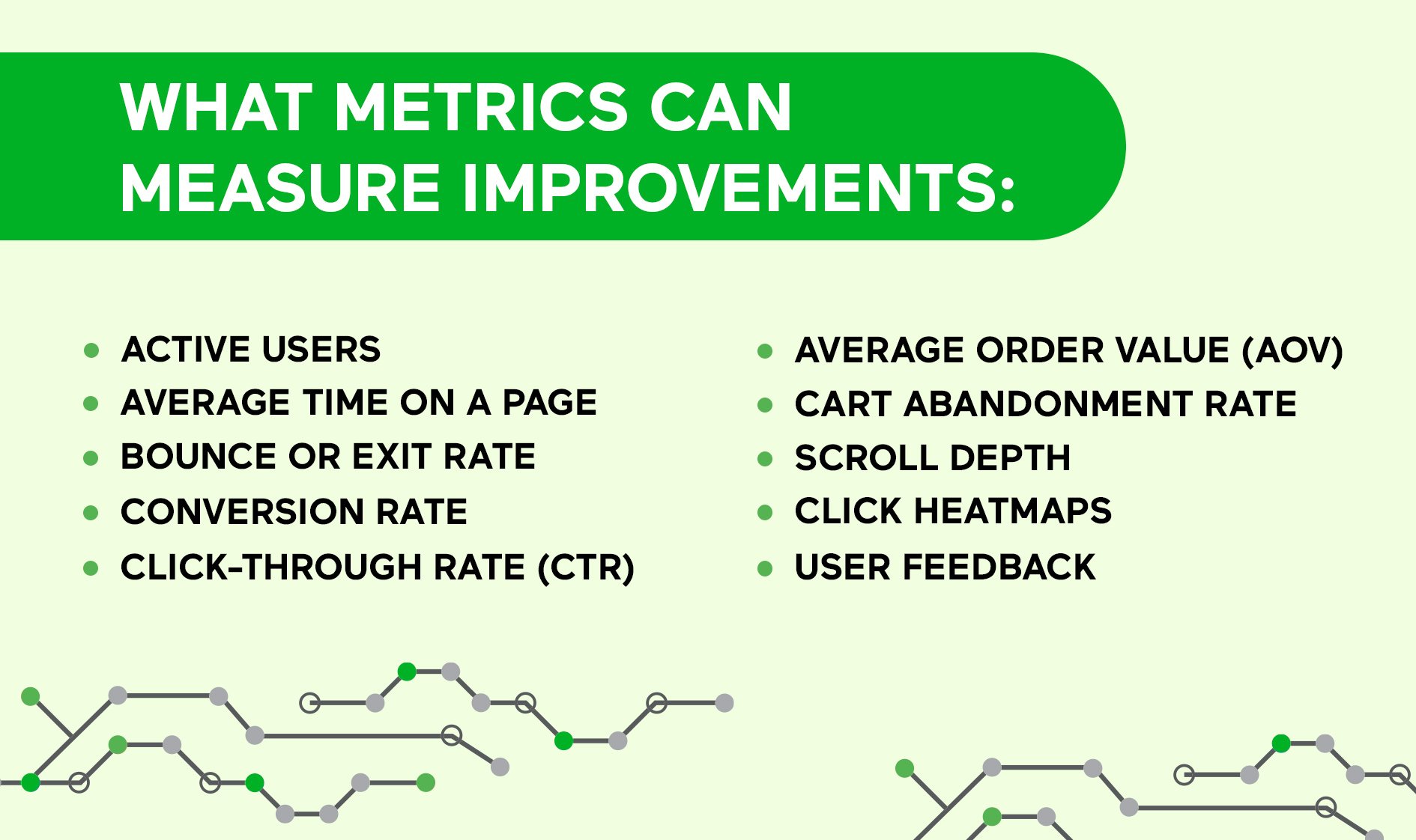
What Metrics Can Measure Improvements?

Let’s now identify some of the key metrics that provide valuable insights into the performance of your product pages. These metrics will guide you toward a deep understanding of how well your product pages are performing and enable you to take strategic actions for improvement.
- Tracking active users on your product pages over a given period of time reveals the level of engagement and ongoing interest in your products. It helps you understand how well your offerings resonate with your audience.
- Average time on a page indicates how long visitors spend on a particular page, giving you an idea of their level of engagement and interest. Longer session times suggest a deeper connection with your content.
- Bounce or Exit rate measures the percentage of visitors who leave your product page without exploring further. A lower bounce rate signifies that visitors find your page engaging and are more likely to delve deeper into your offerings, indicating a higher potential for conversions. A high bounce rate needs to be looked at immediately.
- Conversion Rate is a vital metric to track, representing the percentage of visitors who complete the desired action, such as making a purchase or adding items to their cart. A higher conversion rate indicates a more compelling and persuasive product page.
- Click-through Rate (CTR) measures the percentage of visitors who click on a specific element, such as a call-to-action button. It helps evaluate the effectiveness of your messaging and design, ensuring that visitors are engaged and motivated to explore further.
- Average Order Value (AOV) represents the average amount spent by customers on each purchase. Tracking AOV can help you understand if your changes positively impact the overall value of transactions. An increasing AOV indicates that visitors are enticed to make higher-value purchases.
- Cart Abandonment Rate reveals the percentage of visitors who add products to their cart but abandon the purchase. A high abandonment rate indicates potential issues in the checkout process or product page.
- Scroll Depth. Tracking how far visitors scroll down the page can indicate their level of engagement. This metric offers insights into their level of engagement and reveals whether crucial information or elements are placed optimally.
- Click Heatmaps. Heatmaps visually represent where visitors click the most on your product page. Analyzing click patterns can help identify areas of interest or neglect. By identifying hotspots and cold zones on the page, you can optimize the placement of elements and enhance the overall user experience, ultimately driving more engagement and conversions.
- User Feedback. Gathering qualitative data through surveys, user testing, or feedback forms offers valuable insights into user preferences, pain points, and suggestions.
Optimize Your Product Pages with Pros
Optimizing your product pages requires finding the right balance among various elements. Think of it as a mix of compelling visuals, persuasive content, and user-friendly design. It’s not about favoring one aspect over another but finding the right combination that resonates with your audience.
If you feel stuck and not sure what steps you should take next, you can reach out to our team to get a free audit of your product page or Shopify Plus site. Our Shopify experts will not only help you build ideas to help optimize your product pages but also provide valuable insights and strategies to drive conversions and ultimately design and develop high-converting pages for you.


