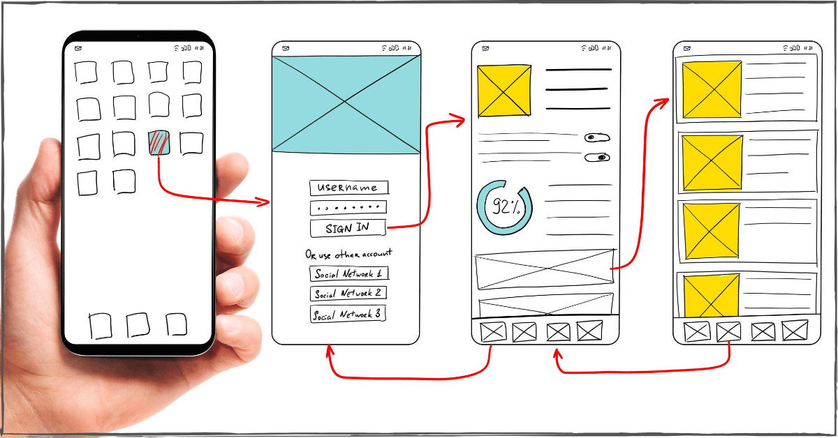
Improve the Mobile App Experience and Keep Customers for Life!
When Apple’s App Store launched in 2008, it offered 500 apps for download. Today, both the Apple App Store and Google Play Store have upwards of 2.5M – 3M apps each[1]. In addition to steady market penetration on the smartphone front, tablets have also seen triple-digit increases in usage within the past ten years. What does this mean for mobile app developers? There’s a big market out there for your product, and it’s not going anywhere.
It’s important to note, however, although app users install between 60 and 90 apps on their smartphones, research shows that the majority of their time is spent using just three apps[2].
One consistent feature that the most popular apps have in common—they’re simple. Take the ever-controversial TikTok, for instance. Its functionality is quite basic. Users can create videos of up to 15 seconds and string those videos together to create stories of no more than 60 seconds. Started in 2016 and now available in more than 150 countries, TikTok boasts more than one billion users[3]. It has even become somewhat of a mainstay with people in #quarantine due to the COVID-19 crisis.
Instagram is another very popular app with a limited set of features but has gained massive popularity for its simplicity and ease of use. Even Facebook gets the value of clearness and ease. They migrated their messaging feature[4] to a standalone app, Messenger, after realizing that the user experience of trying to balance both a newsfeed and messaging platform was too overwhelming and disjointed.
The big takeaway message for app developers: just because you can doesn’t mean you should.

How to Build a Feature List for a Mobile App
Transforming your app from an idea into a product is no easy feat. The key from traveling from an initial concept to ensuring your app will gain traction and be used is always, the end user. Companies must provide value in some meaningful way to the people who will be downloading your app. We can refer to these elements as a “feature list” or a “feature set”—the things your app must have, or do, to solve an issue or address a need. So, when considering the features that you will incorporate, ask yourself these essential questions:
- Will this feature solve a problem for the user?
- How does this feature offer value to the user?
- Is this feature necessary for phase one or can it be saved for future development?
- What is required to develop this feature?
Better yet—don’t just ask yourself, seek input from people who represent your target audience. What features would they value most? What features would they be most likely to use? What features would they consider to be necessary and unnecessary?
Then prioritize your list to identify the top features that are most likely to provide value to your audience. These are the mobile apps features to build into your app—the MVP (or minimal viable product) that you need to produce to delight end users. And, remember—keeping it simple is not a bad thing, it’s a good thing!
What Causes Mobile App Fatigue?
Mobile app fatigue is a phenomenon that occurs when users become overwhelmed or disinterested in using a particular app or apps in general. This can lead to decreased engagement and even app uninstallation. So, what causes mobile app fatigue? Here are some potential factors:
- Too many features: An app with too many features can be overwhelming and confusing for users. This can lead to frustration and ultimately, app fatigue.
- Lack of updates: If an app isn’t regularly updated with new features or bug fixes, users may lose interest and stop using it.
- Poor user experience: An app with a confusing or frustrating user interface can lead to app fatigue. Or an app that constantly crashes during certain acts.
- Lack of relevance: If an app no longer serves a useful purpose for a user, they may lose interest and stop using it.
- Too many notifications: Receiving constant notifications from an app can be annoying and lead to app fatigue.
- Lack of personalization: If an app doesn’t offer a personalized experience, users may lose interest and stop using it.
- A competitor: Another app performs the benefit the user got better than their current app
By understanding what causes mobile app fatigue, developers can take steps to prevent it and improve the user experience. This can include focusing on a few core mobile apps features, regularly updating the app, optimizing the user interface, and being mindful of notifications.
Mobile App Fatigue: Where’s The Proof?
There are several ways to demonstrate the existence and impact of app fatigue:
- Decreased app usage: One of the most obvious indicators of app fatigue is a decrease in app usage. This can be measured through analytics tools that track the number of times an app is opened and used over time. If usage starts to decline, it could be a sign of app fatigue.
- Negative user feedback: Another way to gauge app fatigue is by soliciting feedback from users. If users express frustration or disinterest in an app, it could be a sign that they are experiencing app fatigue.
- High uninstall rates: If users are experiencing app fatigue, they may be more likely to uninstall the app. High uninstall rates can be an indication of app fatigue.
- Low retention rates: App fatigue can also lead to low retention rates or the percentage of users who continue to use an app over time. If retention rates are low, it could be a sign of app fatigue.
By paying attention to these indicators, developers can get a sense of whether or not their app is suffering from app fatigue and take steps to address the issue. By taking the following steps, web developers can help prevent app fatigue and keep users engaged.
5 Ways to Avoid Mobile Apps Feature Overload
Building too many features into your app too often results in feature overload. Research shows, app users value simplicity. An app with a singular focus and clear functionality will beat out apps that are too feature-heavy every day. As you consider prioritizing the list of features you’ll include in your app, keep these important tips in mind to avoid feature fatigue.
- Focus on usability (not utility). What’s the difference between usability and utility? Utility is what your app does. Usability is how it does it. And, most significantly, how it does it from the user perspective. Your users have absolutely no interest in how your app works “behind the curtains.” They have a significant amount of interest, though, in what it does for them.
- Display certain features at key moments. Understanding how and when users will engage with your app can give you important insights into the features that they will need to access at key moments. For instance, when Facebook users see a cute puppy video they want to be able to easily share that video—to their stream, or directly with a friend. When consumers are walking through a shopping area on a hot summer day, they’re likely to be delighted to be delivered a coupon for an ice cream cone at a store a few feet from where they’re at.
- Follow your original product vision. The problem you’re trying to solve will lead to your initial product vision (and hopefully, clear business requirements). That vision will set the stage for the identification and development of features designed to solve that problem, and therefore, add value, to end users. As you go down this path, though, it’s not uncommon to keep thinking of more features you could add, or more things that your app could do.
Some of these things may be relevant, others are likely not. Be careful not to stray too far from your original vision. As new features come to mind, think back to your MVP and business requirements to determine whether they rise to the top of your list or need to move to the back burner for a future version or feature upgrade. - Enable features for specific customers who need them. All customers are not created equal. They will have different needs depending on their unique and personal situations. To the extent you can, consider these differing needs so that your app provides value to specific subsets of users.
- Gather user feedback quickly. The beauty of online apps and the digital environment is the ability to capture and, potentially, act on information and insights quickly. Aggregate and analyze user data as quickly as possible to help you learn how users are actually using your app—and how often. You may even want to consider using an app review plugin[5], as Neil Patel recommends. It’s a great way to get real feedback in real time.
How to Combat Mobile App Fatigue with Spiral Scout
App fatigue is a phenomenon that has traditionally been associated with consumer mobile apps, but it is also a legitimate concern for enterprise IT leaders. As organizations strive to build more apps to drive efficiency, customer engagement, and revenue growth, it is important to deliver a compelling user experience. Unfortunately, the tendency shows that up to one-third of enterprise, apps will fail within six months due to poor user experiences, including app fatigue. This highlights the importance of preventing app fatigue in the enterprise space and ensuring that apps are designed with user needs in mind.
If it’s not already crystal clear, the inconspicuous yet matter-of-fact truth to mobile app development is that less is more. In fact, the “paradox of choice” states that the more choices we have, the less happy we are with the choices that we make. It’s a term that Barry Schwartz, a psychology professor at Swarthmore College, coined in 2004. The paradox of choice captures a belief contrary to the human default, “people presented with more options may have a harder time choosing between them—and feel less satisfied with their final decisions.” When it comes to successful app development, KISS is always a good bet: Keep It Simple (Silly).
Now that you have a thorough understanding of what app fatigue is and its causes, it’s time to take steps to prevent it and improve the user experience. As a software development company, Spiral Scout can help help your app perform well in the app store and avoid app fatigue. By focusing on a few core features, regularly reviewing and removing unnecessary features, optimizing the user interface, regularly updating the app, and being mindful of notifications, our professional team will help prevent app fatigue and keep users engaged.
Also see:
13 Mobile App Development Trends
React Native App Development vs. iPhone & Android App Development
References:
[1] https://buildfire.com/app-statistics/
[2] https://buildfire.com/app-statistics/
[3] https://wallaroomedia.com/blog/social-media/tiktok-statistics/
[4] https://www.theverge.com/2014/11/6/7170791/mark-zuckerberg-finally-explains-why-he-forced-you-to-download-the
[5] https://neilpatel.com/blog/increase-mobile-app-reviews/


