Transforming a Venture Capital Leader’s Digital Presence
Vue.js & Nuxt
for modern frontend
Flux
Architecture
Contentful
headless CMS
Solutions
Industries
Technologies

About THE Project
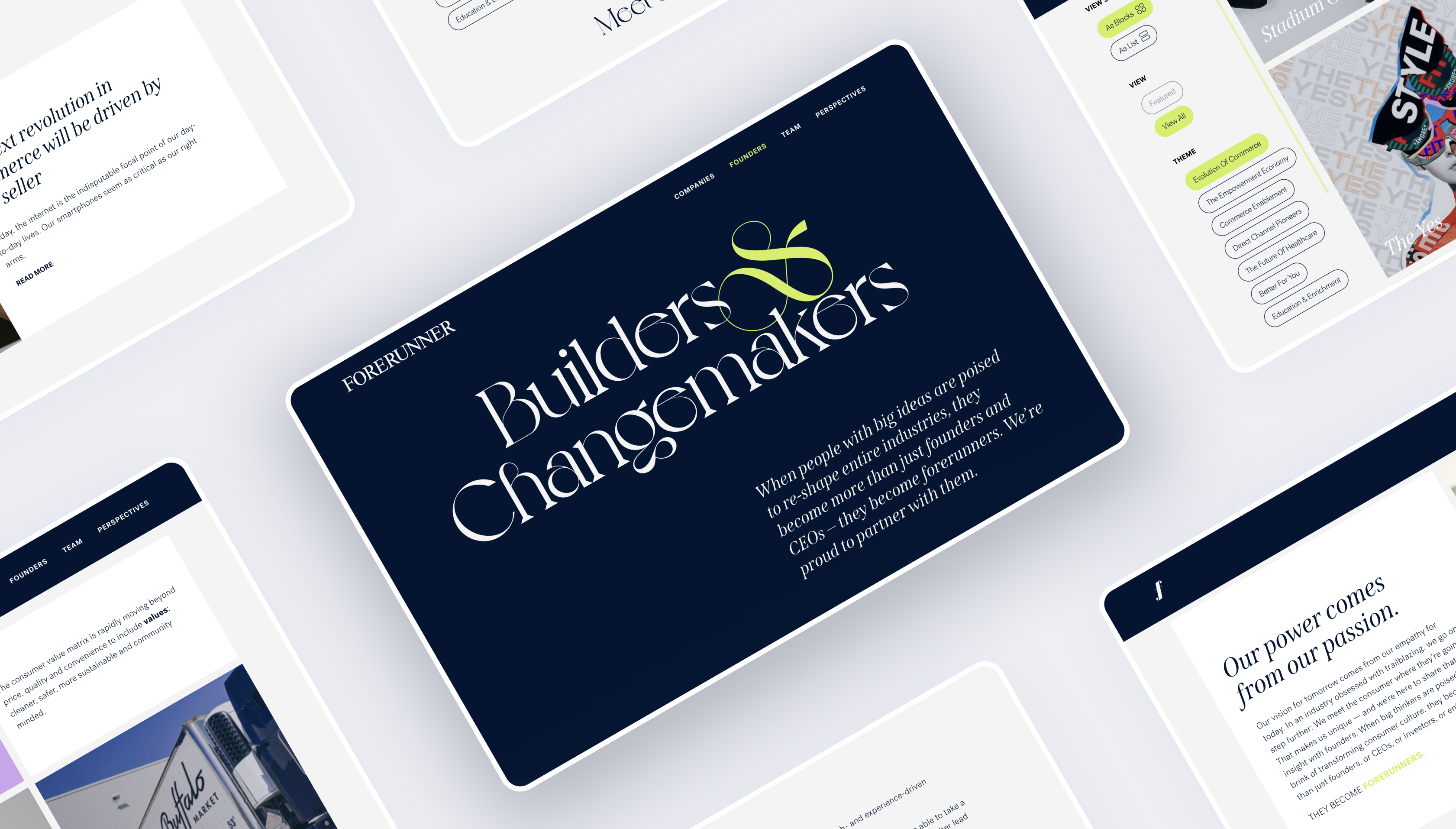
Forerunner Ventures, a San Francisco-based venture capital firm, has been at the forefront of investing in the most transformative consumer startups of the past decade. With a portfolio that includes some of the most recognizable brands, Forerunner wanted a website refresh that would match their trailblazing reputation, showcase their investments effectively, and allow their team to manage updates without relying on developers.
Their previous website lacked flexibility, was difficult to update, and didn’t fully communicate their brand’s vision. They needed a cutting-edge, visually compelling, and user-friendly platform that could be updated effortlessly by non-technical users.
Spiral Scout stepped in to redesign the site, implement a modern frontend, and integrate a headless CMS that would give Forerunner full control over content updates while maintaining high performance and scalability.
Objectives
- Deliver a bold, visually compelling website redesign that reflects Forerunner’s industry-leading position.
- Enable non-technical team members to update site content without requiring developer assistance.
- Meet a strict project timeline to launch the refreshed website within Forerunner’s internal deadlines.
- Ensure a smooth collaboration process with Forerunner’s design and marketing teams.
Challenges
Solutions
Balancing Design Ambitions with Performance Needs
Forerunner’s vision for their website was bold—high-end animations, immersive visuals, and a modern layout. However, maintaining these design elements without sacrificing performance was a major challenge, especially for mobile users.
Design Refresh and User-Friendly Updates
To address this, Spiral Scout’s web developers and designers leveraged Vue.js and Nuxt, optimizing how elements loaded dynamically. Lazy loading strategies and content caching ensured the site retained fast load times while still delivering an engaging user experience.
Giving Forerunner Full Control Over Content Updates
Previously, Forerunner relied on developers to make even the smallest content updates, which slowed down their ability to keep the site fresh and relevant. This lack of flexibility became a bottleneck for their marketing and content teams.
Headless CMS Development
To solve this, we implemented Contentful, a powerful headless CMS that allowed Forerunner’s team to update text, images, and media instantly without technical expertise. This transformed the way their team managed content, allowing for faster updates and greater agility.
OUR Project strategy
Overview of the critical steps that shaped the Forerunner’s success and addressed its key challenges.
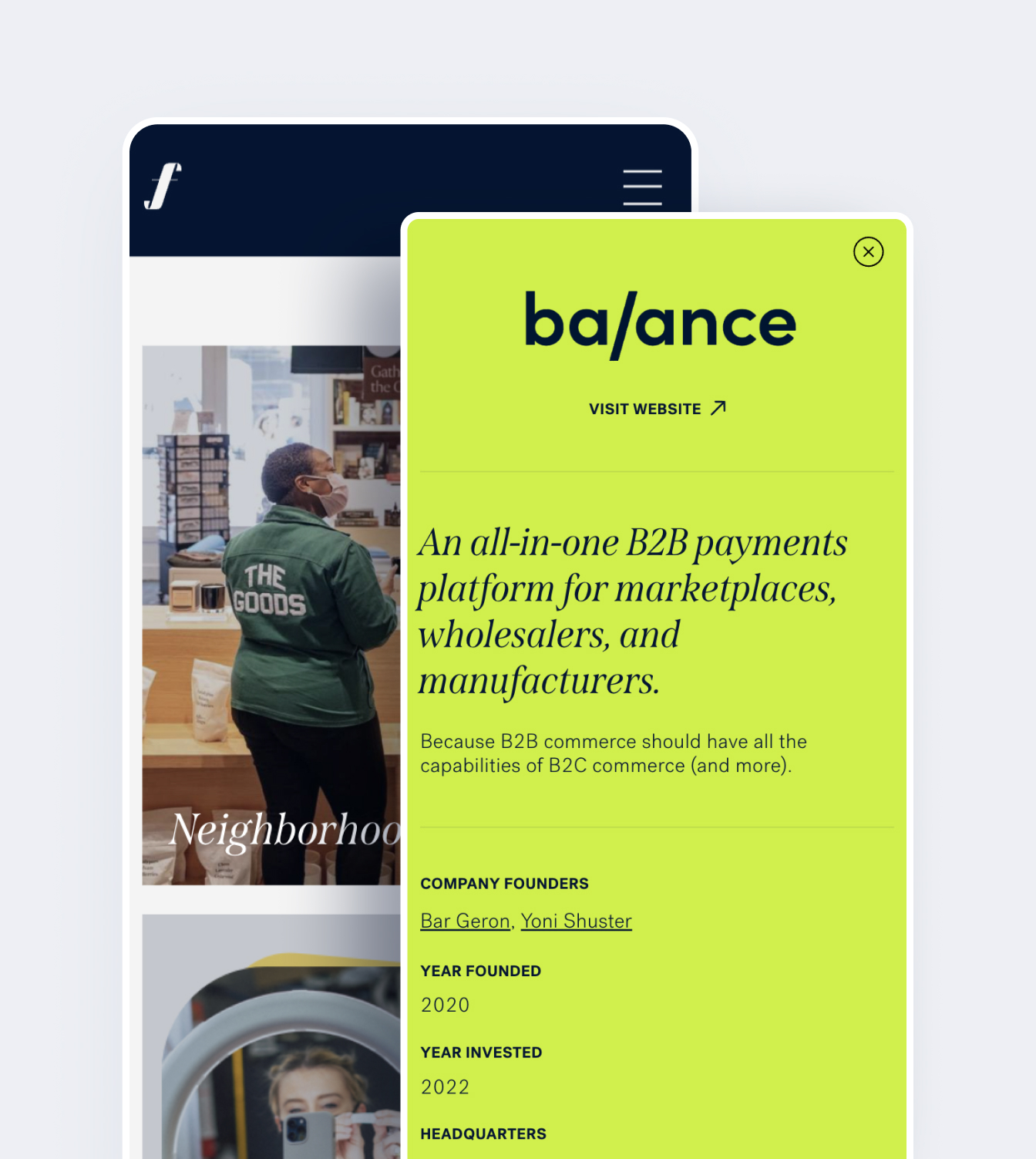
Collaborative Design Review & UX Enhancements
We conducted a design review with Forerunner’s team, identifying UX/UI improvements that would enhance navigation and user engagement while staying true to their brand vision.
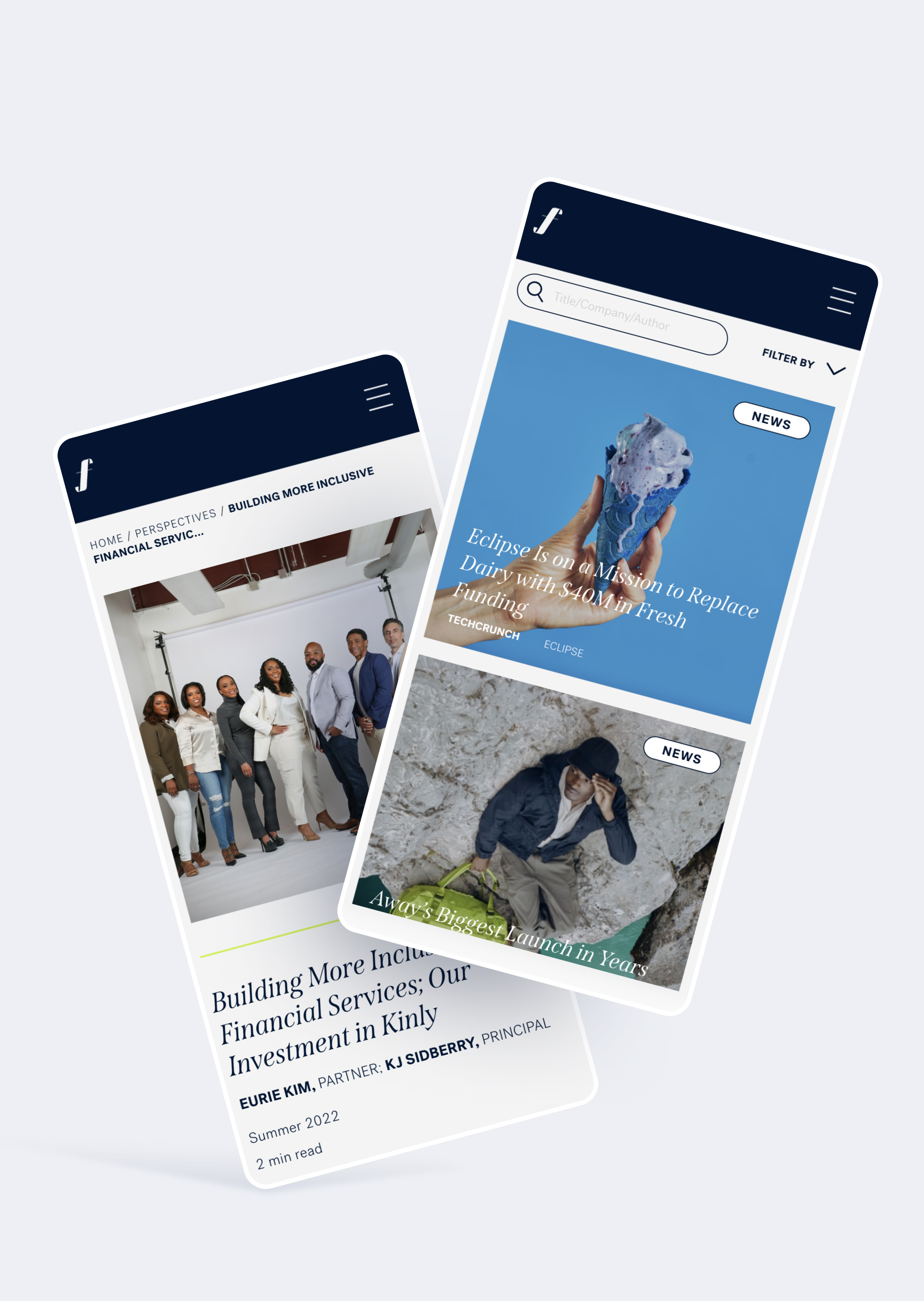
Incremental Development for Faster Deployment
Instead of waiting for a full redesign, we applied new design elements directly to the existing codebase in phases, ensuring an efficient, product-led rollout with ongoing feedback loops.
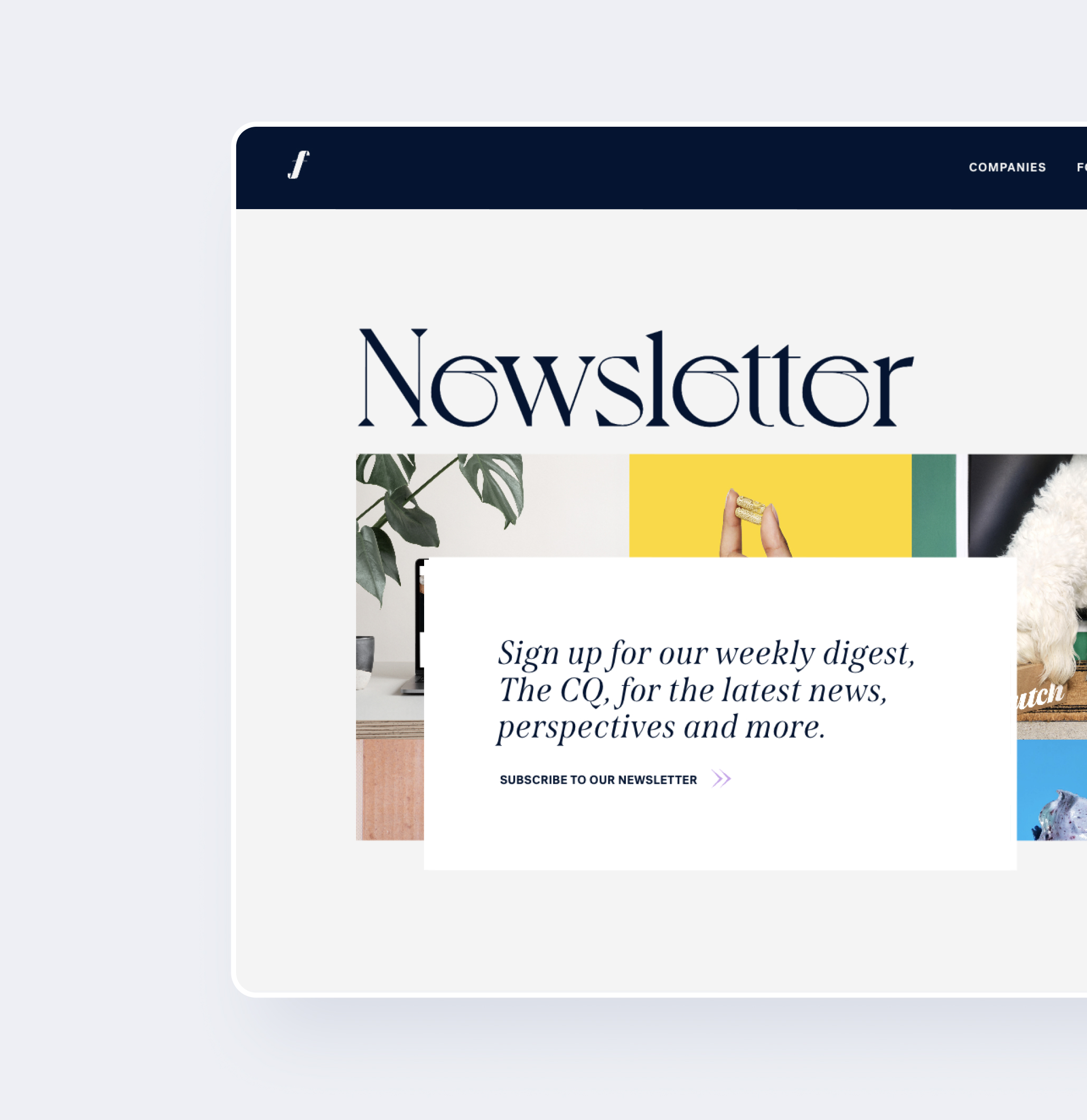
Seamless Headless CMS Integration
We implemented Contentful, allowing Forerunner’s team to edit and manage content independently, eliminating reliance on developers for updates.
Project results
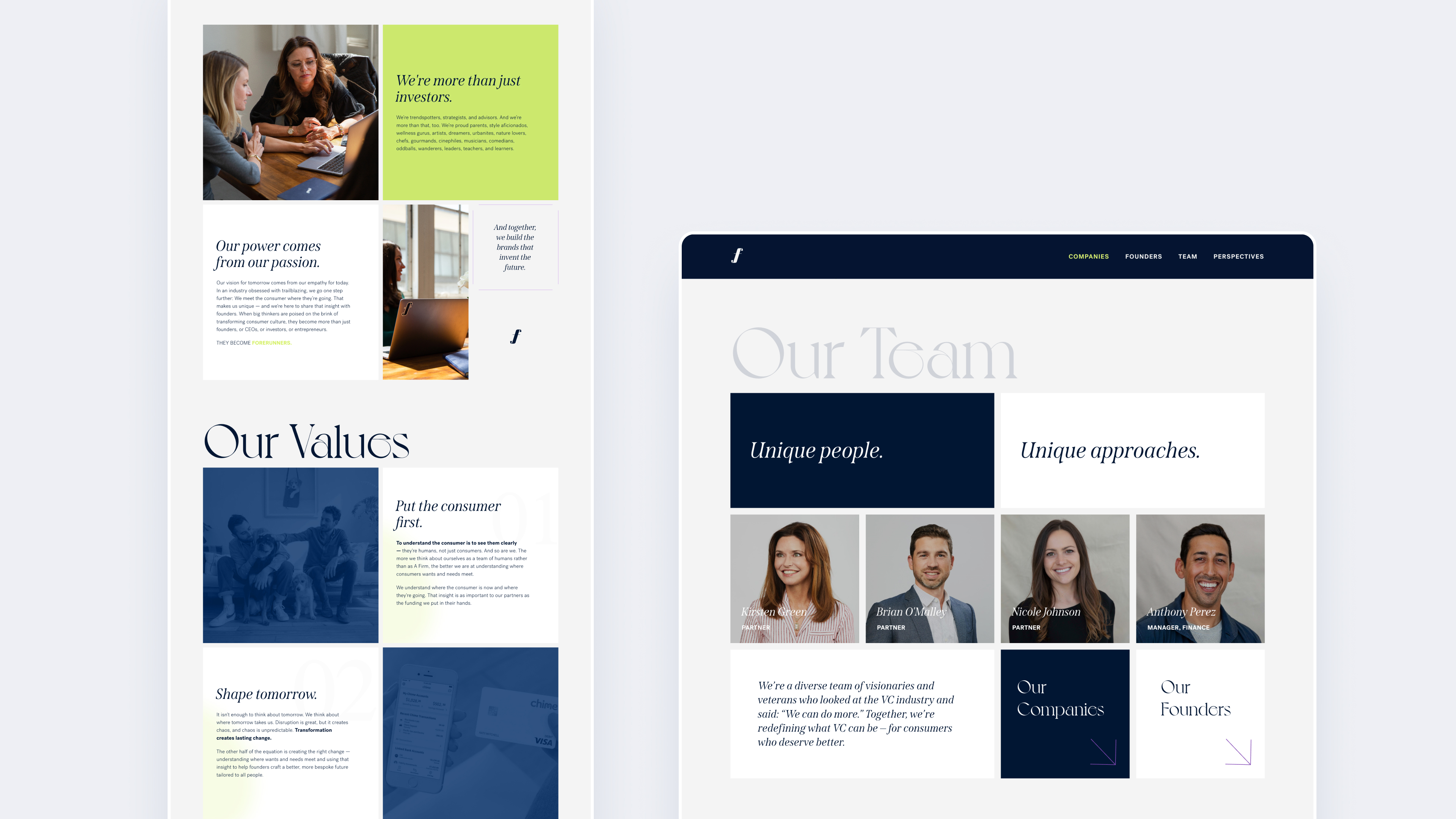
The new Forerunner Ventures website delivered a striking visual impact, seamlessly blending high-end design with performance-optimized development. The platform not only elevated Forerunner’s online presence, but it also gave their team full control over content management for the first time.
The site’s performance, flexibility, and usability improvements made an immediate impact, earning multiple design awards and further reinforcing Forerunner’s position as a leader in the venture capital space.
We continue with website support and watch with pride as Forerunner continues to shine with success in the VC industry.
Key metrics
- Delivered an award-winning website redesign that received industry recognition for outstanding UX/UI.
- Implemented a headless CMS that allows instant content updates without developer involvement and saved thousands of dollars each month in dev costs.
- Optimized site performance to handle high-traffic loads while maintaining fast load times of under 2 seconds.
- Successfully launched within the client’s strict deadline, ensuring a smooth transition.
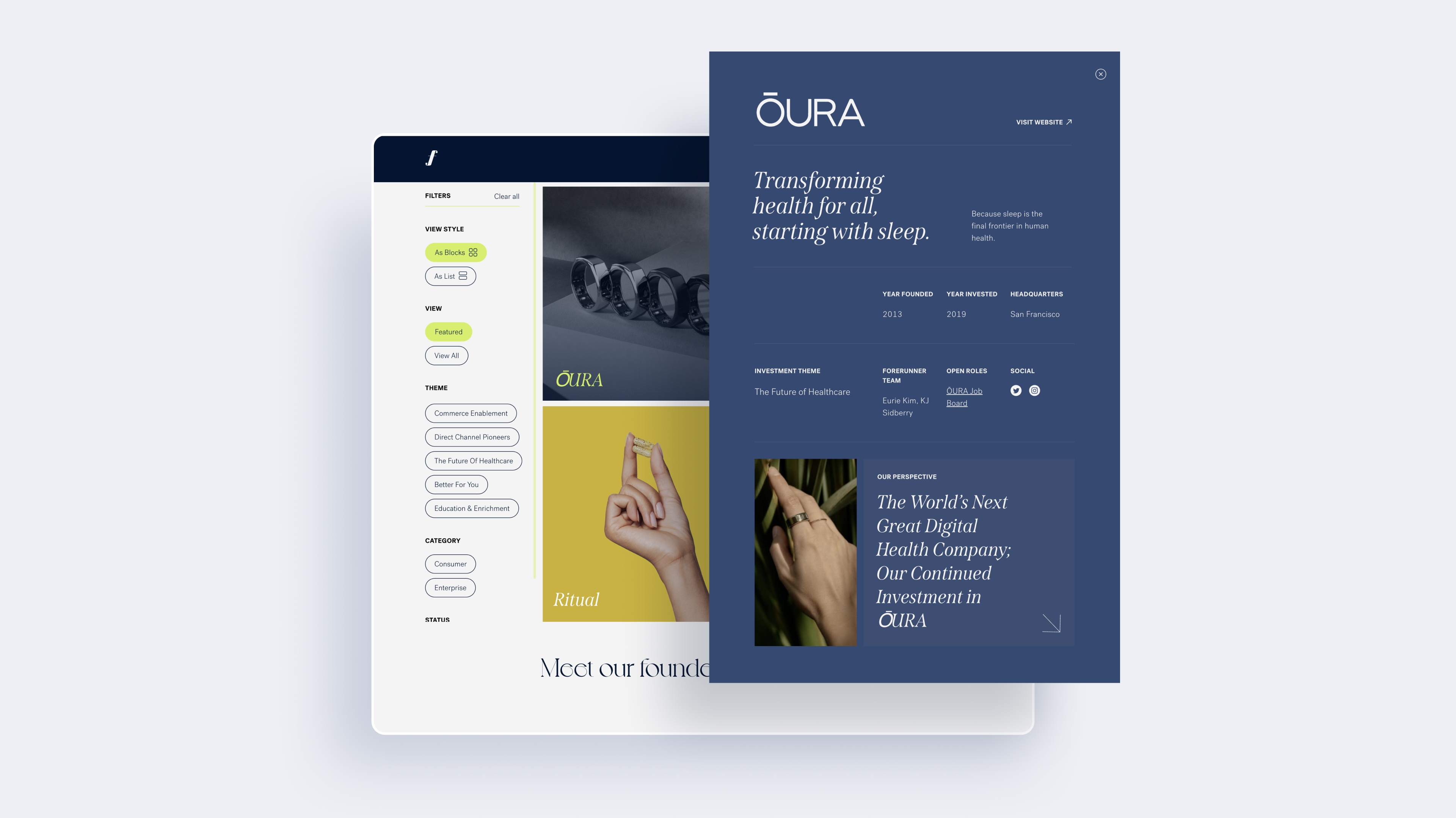

By discussing and approving the designs and their implementation on the Forerunner staging site, we saved time on both design and development efforts to help us meet their strict deadline.
OVERALL SCORE
At Spiral Scout, we believe that when it comes to software development and delivery, it’s time for a change.
5.0
SCHEDULING
On Time / Deadline
5.0
QUALITY
Service & Deliverables
5.0
COST
Value / Within Estimates
5.0
NPS
Willing to Refer


